A First Impression Is A Lasting One W/ Front End Web Development Services

Companies either embrace digitization of the business landscape or lose relevance among the competition. Most will increase their investment in an effort to draw the target audience and engage them. In order to do that, businesses must be visible on the online platform, transparent, credible, and trustworthy.
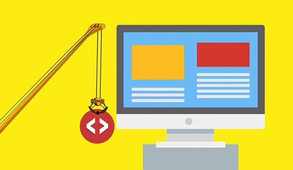
These criteria can be met by producing an effective website that appeals to the customer and offers them the ideal experience. This is made possible through front-end website architecture and design. The various website components visitors use, see, interact with, involve front-end development.
Creating a stunning, modern front end takes incredible forethought to ensure the designer gets it right out of the gate. You can gauge the success by how it stands up to others in the same industry. When the traffic is increasing and your reach is expanding, the current objectives have been met.
How Can You Improve Your Front-End Design
In today’s digitized business landscape, companies need to have a visible online presence so that the target audience can find them and engage with them. The best way to make a lasting impression on this group is to produce an outstanding website design.
A front-end experience should showcase the business’s integrity, credibility, and trustworthiness with simple, animated, and vibrant content. The architecture should be functional and appealing.
Learn tips on better front-end development at https://ihatetomatoes.net/8-tips-become-better-front-end-developer. Then follow here for tips on improving your existing design to stand out from others within your industry.
Keep it current
Many companies don’t recognize the importance of a fully responsive modern interface, which functions smoothly from one device to the next. When the goal is a contemporary design, prioritize simplicity. In that vein, the suggestion is to work with adequate white space, flatter elements, and vibrant colors.
Each page should have a designated objective with a concise CTA—call to action—helping to navigate the user’s direction. Once you have this foundation, animation, visual elements, and videos meant to add personality will be next. Before adding each component, however, ensure that they have relevance and value.
Again, you want to avoid putting things in the design that have no purpose, clutter. The objective is to maintain clarity and brevity. Click for details on website development.
Bring in the visuals
You want your visuals to be vibrant and appealing to draw the user in and engage them, making them want to dive in further. If these are lackluster, don’t add them. You’ll be unnecessarily cluttering the design. The architecture can include illustrations, photos, animation, and video, but these should be of the highest quality.
It’s possible for one poor image to wreak havoc on the entire front end, regardless of whether the remainder of the design is impeccable. Fortunately, only a few of these components are needed to develop an effective user experience.

You can settle on two high-quality, precision visuals to stand out with the audience, illustrations or photos, or perhaps a single appealing animation to make a lasting impression. Each item should be optimized. Illustrations should come from “vector-based files,” and photos should be of a high resolution.
Consider typography
Users will only interact with a website they can easily read. You want to focus efforts on selecting typography that’s fun but user-friendly. Novelty fonts can be complex but are also fun. The ideal typeface with front-end development will be straightforward and simple regardless of the letter sizes.
The thickness must be sufficient so that a user can pick up the content with merely a glance but not so bold that the content appears to be “screaming” from the post. The recommendation for those trying to add greater visual appeal is to blend opposite styles for the body and headline.
Obvious is good
You might believe that all the elements must be unique from what everyone else is doing, but that’s not the case. You want the user to have a positive experience with easy navigation. A simplistic, obvious design is better than one where the user is confused and the elements are jumbled.

On many websites, the shopping cart tab is similar and situated virtually in the same spot, with navigation usually at the top of each page. Users come to expect this and don’t have to search when trying to maneuver through a site.
As mentioned earlier, the objective is to ensure that the front end is simple and straightforward; obvious is good.
Final Thought
You might have a front-end concept, including the visuals, colors, navigation ideas, and on, but have minimal time or knowledge to implement the thoughts into a functional architecture.
Fortunately, you can work with a professional third-party software team to bring your ideas to fruition. Perhaps the experts can make additional suggestions to ensure that when the project is complete, your site will stand out among others in your industry, making a lasting impression on your target audience. Visit Ronins.co.uk to speak to an experienced developer of an advanced digital agency.

 Essential Smart Tips for Working with PDFs
  How Developers Can Build High-Performance Web Applications on a Limited Budget
  How Standalone Tools Transformed Into Connected Platforms?